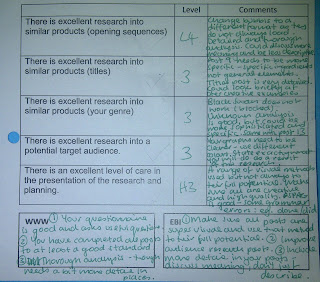
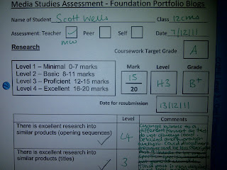
Here is the assessment sheet that one of my teachers filled out whilst marking and evaluating my 'Research' posts. In order for them to fill this out, they had to look through my 'Research' posts on my blog, and find what I did well, and what could be improved. Once they looked at this section of my blog, they then gave it a mark out of 20, as well as the grade they believe I am working at the moment. As you can see I got 15/20 which is a B+. From this sheet I will take on board all of the imporvements and change them in order to improve my grade for the future.
Labels
- Assessment (10)
- Brief (1)
- Evaluation (7)
- Induction (4)
- Plan (11)
- Preliminary Task (1)
- Research (14)
Monday, 12 December 2011
Friday, 9 December 2011
Peer Assessment: Feedback of 'Planning'
Here is the assessment sheet that one of my other classmates filled out on my 'Plan' posts. They had to work through each section and go through my blog, and mark what I had done so far. For each section, they had to give a level and also say what I have done well and what I could improve for the future; for instance higher quality photos. All my posts were done to a very high standard, presented well and they were all supervisual.
Thursday, 8 December 2011
Location permission
In order to film our opening sequence, we had to get permission from the land/building owners to ensure that we were granted permission to do this. So, we had to ask a number of different people to allow us to film, these include:
Bronte's house home owner: Dawn Walker.
Below is an application form for a 'Small crew filming in Sutton'. We filled it in as below and sent it back to the council/ sender.
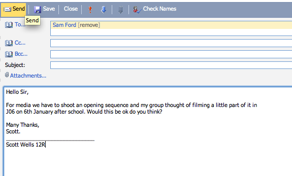
Here is an email that I sent to a fellow teacher to ask permission to film in one of their classrooms:
Bronte's house home owner: Dawn Walker.
Emails sent to Sutton Council and City of London asking permission:
These emails are requesting permission for my group to shoot in certain locations where we need permission to film.
Below is an application form for a 'Small crew filming in Sutton'. We filled it in as below and sent it back to the council/ sender.
Here is an email that I sent to a fellow teacher to ask permission to film in one of their classrooms:
Shooting Schedule
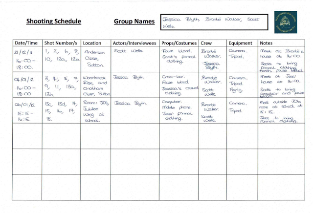
Here is our shooting schedule. This tells you the dates, times, shot numbers, locations, Actors, props, crew, equipment and any notes:A shooting schedule enables us to check we have everything we need, and by when. It keeps us on top of everything, and makes sure we on schedule to complete it.
Below is a YouTube video that shows me and Bronte planning our sequence and filling in the shooting schedule.
Storyboard
Here is our original storyboard: We done this to act as a guide when we shoot our opening sequence. When filming, we will follow the storyboard shot-by-shot - it ensures we have as much information and details when filming; we know exactly what we're doing.
Here is an animatic which effectively shows our storyboard by each picture accompanied by the soundtrack. This shows what our opening sequence would look like through using the images we drew.
Wednesday, 7 December 2011
Titles
Font:
For the title of the film: "Shattered". We would like to use fonts that look like this:
'Broken 74', found on www.dafont.com:
'Cracked':
'Distorted and Scratchy', found on www.dafont.com:
'Cracked Dendrite' , found on www.dafont.com:
'Psychotic', found on www.dafont.com:
The cracks in the font put emphasis on the film's title, therefore allowing it to appear effective, as well as giving an insight to audiences about what is to come and the synopsis of the film.
We would possible use 'Broken 74' as it is the most realistic one and we feel it isn't to much and cliche. It fits perfect with the title and with the film as well.
For the cast/crew of the film, we want to use the font called 'Didot', found on Microsoft Word. It would look like this:
'SCOTT WELLS'
We would want the titles to be in capitals as this would make it stand out and seem bold, as well as making a statement.
However, when completing the titles for our opening sequence we looked through and experimented with different fonts, and as a result of this we didn't end up using 'Didot' as the font. We decided to use 'Optimus Princeps Semi Bold' found on 'DaFont' instead, as we felt it would be more striking to the audience whilst still having the statement aspect.
Content:
The titles will be played over a moving image - therefore intriguing audiences, as well as informing them. We also decided to display them over a moving image because, when we carried out our questionnaires, the majority of respondents preferred titles to be presented over a moving image rather than a black background.
Positioning:
The production/distribution companies as well as the title of the sequence will be placed at the centre of the frame. Whereas the cast and crew of the film will be located at different points within different shots; their positions will change depending on where they fit/suit the shot.
Order:
1. Distribution companies.
2. Production companies.
3. Title of the film
4. Film's cast: actors.
5. Film's crew: casting, editor, costume, director, etc.
Casting
Below are the Actors/Actresses names and their character roles in the opening sequence and why we have chosen them to portray that specific role.
Jessica as Emily:
Jessica as Emily:
We have chosen Jessica to play the role of Emily as we wanted to challenge the gender stereotype. Commonly, thrillers do not portray females to being dominant so we wanted to emphasise this idea. We also felt that a female stalker would fit more into our story line.
Scott as Daniel:
We wanted to use the same idea with challenging common stereotypes. This character is well built and seems to be intrepid, however comes across as being scared and vulnerable in the opening sequence. We chose Scott to play the main character as he has previous experience in playing different roles in Drama.
Character Descriptions.
Jess' Character 'Emily':
- Age: 25
- Sex: Female
- Occupation: Businesswoman
- Relationship status: Single
- Personality: A very misunderstoof, isolated and mixed up person. Quite shy and vulnerable. She suffers from a slight mental illness
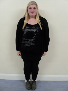
- Appearance: Blonde, grey eyes, dressed in casual clothing and is of a medium height.
- Hobbies: Enjoys ary, literature and simple things.
- Age: 26
- Sex: Male
- Occupation: Businessman.
- Relationship status: In a relationship.
- Personality: Bubbly, kind, well-mannered. Complete opposite to Emily.
- Appearance: Well built, quite tall, hazel eyes, dark brown hair with blonde and red highlights. Dresses both smart and casual.
- Hobbies: Enjoys watching and playing sports, as well as socialising with friends/ spending time with family.
Props, Costumes and Locations.
Props:
- Crow bar,
- Fake blood,
Jess:
- Casual: Jeans, tops, cardigans/hoodies, plimsoles/pumps.
- Formal: Smart top, trousers.
- Make up: Natural.
- Smart: Shirts, Trousers, Shoes.
Bronte's Road:
For the majority of the opening of the sequence where we're slowly revealed bits of the victims body.
Streets:
This location will be used to show Jess' character walking away from the scene of the crime and will reveal key aspects of her character to the audience.
Thursday, 1 December 2011
Peer Assessment: Feedback on Reasearch
Here is my Peer Assessment sheet that one of my other classmates done on my blog. They had to go through it and give me a specific level of what they believe I am working at on certain aspects listed in the far left column on the table.
My main WWW (What Went Well) was that I use a wide variety of supervisual elements and techniques. I try to use as many so that when people are going through my blog it doesn't become boring and uninteresting for them to read. However, my main EBI (Even Better If) was to make sure I had my video annotations for one of my posts and to make one supervisual as I didn't do that. I have made all the corrections that have been noted and I'm also going to work on keeping a high standard of work throughout this project so that I can achieve the best possible grade I can. I will also persist to use as much supervisual techniques and material as I possibly can to keep my blog looking intriguing and interesting to look though.
Sound
In this short clip above the sound that you hear is branches brushing against one another and also wind and other specific elements. This would work really well in our opening sequence as it would build up a specific eerie atmosphere having the effect of putting the audience on edge and also help to build up the scene. Also in the clip you can see how the sound is made: by clanging together a large amount of sticks and branches along with the use of the ambient sound around.
In the video above the use of footsteps through leaves would be really effective to add to the overall atmosphere and to add a sense of mystery as you could just have a close up of the feet walking through them not revealing the characters identity or you could be focusing on one character and then having this sound would communicate and tell the audience that someone is walking up behind them adding a lot of tension to the scene.
This clip of footsteps could be linked with the leaves above as previously mentioned. The use of just footsteps will make it really clear to the audience that someone is approaching towards the character and it could also make them sound more dominant giving the character more status just by the sound of the footsteps.
Heavy Breathing:
By clicking on this sound clip it will let you hear the sound of heavy breathing. This could be key in our opening sequence as it could inject pace and panic as the character is ovbiously worried by something in order to be breathing like this. The use of this could also be used with an echo to really emphasise it to the audience making them feel just how the character does.
Ambient sound:
This clip lets you hear a recording of an ambient scene; you can hear traffic and everyday sounds which could be used to build up and establish a scene but also to use in certain scenes such as the flashbacks of which we want to include in our opening letting the audience relate to it.
Wind:
When listening to this clip it automatically creates a really eerie/uneasy and creepy mood due to the fact that its really slow and it puts the audience on edge straight away. This would be used as a really good sound to have right at the start of the opening sequence whilst the logo's etc. are shown. This would establish the intended atmopshere right from the start, hooking the audiences attention straight away and keeping them wanting to watch on.
Phone ringing:
Here's a clip of a phone ringing that will distract Jess from her daydream.
Tuesday, 29 November 2011
Shot List
Here are the shots of which we want to include in our opening sequence to our Psychological thriller:
Over the shoulder:
The effect of this shot gives the audience a different perception and view on the situation and also the other character. It makes the audience almost feel more of a part of the piece, engaging them and revealing the expressions effectively.
Dutch Tilt:
A dutch tilt can be used in our opening sequence to communicate confusion and establish a certain uneasy atmosphere. This will clearly go with our genre of a Psychological Thriller as these are commonly seen throughout them. This camera movement can be used in any camera shot to give a different, desired effect on the audience.
Both of these shots are similar in the way that they both reveal a lot about the location but don't really focus on what the characters are doing. By doing this it points out to the audience that this is a key location and to pay attention to it. The other purpose of this shots is to set the scene so the audience know exactly where the film is set.
We want to possibly use this shot in order to show the body language of two characters at the same time. This can also show the relationship between the two as if they're close we know they are comfortable with one another, if they were far away we would pick up on it.
Over the shoulder:
The effect of this shot gives the audience a different perception and view on the situation and also the other character. It makes the audience almost feel more of a part of the piece, engaging them and revealing the expressions effectively.
Long shot:
A long shot allows the audience to really look at the character as it reveals all their costumes and still manages to communicate some of the facial features. The use of this can also give an insight into the character themselves; their attitude, personality and mood.
The use of a high angle makes the person/ character/ object appear small. This could communicate and illustrate isolation and vulnerability as its like the audience themselves are looking down, almost judging the person. This could be used effectively in our opening sequence to represent status and to enforce the atmosphere in certain circumstances.
The low angle completely contrasts with the high angle not just because it shows the character in a different light but by looking at the image there is a real sense of power and authority communicated from it. This could be used in our opening to show the status between the characters giving the audience an insight into them more.
Mid Shot:
Mid shots are effective in just generally presenting the character to the audience as they are still shown the top half of the body so they can still see some, yet limited body language but you focus more on the characters facial expressions and you can clearly see them. This would be good to use if we want to show both; expressions and body language.
Close ups are ideal in revealing the characters facial expressions and identity. It lets the audience focus of their details and to clearly identify them for when they appear later on in the film. Close ups would be used to help create and add to a specific mood and atmosphere.
This type of shot reveals more to the audience in a sense of detail and establishing expression. This specific shot could be used (just like the image) to present a character walking, this in a way will create a mysterious atmosphere as you cant identify the person; clearly linking in with the conventions of our chosen genre.
This shot type is commonly used in thrillers as it doesn't reveal to much of the characters identity, building up the mysterious atmosphere for the audience to be engaged by as it doesn't give away to much, making the audience want to watch on an get introduced into the character.
Dutch Tilt:
A dutch tilt can be used in our opening sequence to communicate confusion and establish a certain uneasy atmosphere. This will clearly go with our genre of a Psychological Thriller as these are commonly seen throughout them. This camera movement can be used in any camera shot to give a different, desired effect on the audience.
Friday, 25 November 2011
Film synopsis
At the beginning of the film, the audience are introduced to Jess' character (Emily). We witness her everyday life and how it begins to spiral out of control. Then at once we see her turn, we see that she has created in her mind a relationship with Scott's character (Daniel). A man she believes she knows yet he has no recognition of her.
Things turn for the worst when Emily's mind deteriorates when she becomes obsessed over this person she doesn't even know. Emily is heartbroken when she learns that Daniel is in a strong, stable relationship with the woman that once her best friend. Later on we then watch on how Emily can't control herself anymore...has she gone to far?
Initial Ideas
The locations that we think we could possibly film in would be dark, eerie places to create a specific atmosphere. The use of low key lighting which would reveal/not reveal the aspects chosen. We thought up locations such as Waterloo, Piccadilly and a general house.
Focusing on costumes, props we wanted each character to have a specific one so that the audience can clearly identify them. The costumes need to communicate and suit the personality/ attitude of each one The props need to link in with what's happening e.g. knife, fake blood etc.
When working together we developed our ideas by taking the basic point of "challenging stereotypes" and thought how we could work around this. We each took turns in what we thought we could do and if it would work and be effective. We chose to do a thriller as we really wanted to concentrate on building up the tension/suspense as wall as giving an intriguing story line. We also wanted to break away from the typical stereotypes of the role of genders in the genre.
Advance research-Questionnaire
Here are the results that I found whilst carrying out research on the audience; their likes, dislikes, interests and expectations:
Looking at the results in the gifs and the charts created you can clearly identify what our target audience is looking for in a good and effective opening sequence. The reason I chose these 3 specific questionnaires is due to the fact that two are from the target audience age and the other isn't. I wanted to do this to show how different aged people feel about what they want to see and what they think about the specific genre itself. For example, when comparing the 40+ to the 21-25's answers we see that the younger answers are much more stereotypical locations that they say they see in an opening sequence such as a haunted house. Where as the 40+ states locations such as country sides, eerie narrow streets and places that build up an atmosphere. Also looking at each of my questionnaires you can clearly identify that the conventions that the audience commonly want to and see in an opening sequence are: titles over a moving image, low key lighting, uneasy (eerie) music and a non-linnear narrative. By taking into account each individual's answers my group and can clearly work out what our audience want to see and want they don't. We can take this on to develop our ideas when producing the opening sequence so it appeals to our target audience effectively. With these results found from the research we are going to include the title over a moving image, uneasy/eerie music and make it a non-linear narrative.
This graph above shows how old people were who took part in answering the questionnaire. The majority of people asked were aged 16-20 which is our intended target audience. The other ages were asked as I wanted to know what their views were and opinions are to then compare them to those of a younger age.
This chart above simply shows that more females were asked than male. This could then give an insight that maybe more females watch Thrillers that Males do.
This graph above shows peoples favorite genre. As you can see Thriller is one of the most popular which reinforces that this is a popular genre and suggests that we'd have a wider audience of which this will be aimed to.
This chart above clearly shows what people mostly like to see in a Thriller opening sequence. As seen above you can see that the most popular elements were: 'Title over moving image', ' Uneasy/eerie music', 'A Non-linear narrative', 'Low key lighting' and 'Symbolic, foreshadowing imagery'. We're going to take all these opinions into consideration and include them in our sequence.
Location research
This first photo looks effective as you have the eerie trees hiding the houses of parliament and Big Ben in the background. This to me gives them a human characteristic as it seems as they are looking over you. Also the lighting in the extreme long shot wouldn't really reveal to much of the character, creating a mysterious aspect and also gives the audience a sense of location as you know where it is based but still doesn't give away anything about the storyline itself.
This second location has a sense of mystery to it as its really empty, there's no one walking and appears to be quite spooky and eerie. this would be a good place to film as you can get some interesting shots and anglesof whatever you're filing and also due to the fact that the persons face would be sort of hidden due to the lights. I think this because as people were walking past i couldn't really makes out their faces which just adds to the whole mystery element that this location withholds.
The reason I took this photo was due to the fact that there is this giant, old aged building in the background which is partly hidden by the trees in front. Also the atmosphere that is created by this is daunting in the sense that you have this spooky looking building lit up by a few lights almost haunting the photo. The extreme long shot really creates a general negative mood due to the effective Mise En Scene within.
Subscribe to:
Posts (Atom)